Lesson 1
Performance Objective
"Learners should be able to identify the levels of Bloom's Taxonomy and ISTE NETS Standards".
Performance Outcome
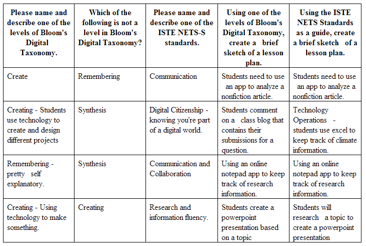
The following table displays answers by learners to the assessment given at the end of Lesson 1. The questions asked in the assessment quiz learners on the Remembering, Understanding, and Applying levels of Bloom's Digital Taxonomy.
Learner's Reactions
At various stages of the Web Application's design, we presented the material to two sets of learners. One was a mixed group of experienced and inexperienced educators from the United States, and the second was a group composed of first year educators teaching at a bilingual school in rural Honduras. Both groups offered the following reactions on the content and web design:
After this feedback, changes were made to the site, including replacing the flower graphic and revising the content of the lesson to more closely address content of the assessments. Once those revisions were made a second review was made:
Intro page
- Once you get to the first page, it is not clear what to do next. It was thought that this was the only page.
- It would be nice to have some forward and back buttons.
- The intro page would be better if it was interactive.
- What is the difference between Blooms Digital Taxonomy and Bloom's revised? Not clear.
- Flower was not liked by one user.
- Would be great if there were a link to the ISTE page.
- The ISTE section never defines NETS-S
- Need more information on what ISTE is/does and why that is relevant.
- ON menu, BDT & ISTE NETS is all that is listed on quiz link. It would be nice to know that is a quiz page on the menu.
- What is taught and what is quizzed doesn't match. The questions ask for a brief sketch of a lisson plan for ISTE and Blooms, but that wasn't taught.
After this feedback, changes were made to the site, including replacing the flower graphic and revising the content of the lesson to more closely address content of the assessments. Once those revisions were made a second review was made:
Intro page
- Nice Intro
- I wish there was something that prompted you to care about the intro page. I skipped it until I was prompted.
- Interesting picture, I wish it would resize when hovered over like on Tumblr so I could get a better look at it.
- Wow, there’s a lot of content here. I wasn’t expecting that after the last page. This suffers some of the same clutter problems as the intro. Great info, but could be spread out, maybe onto another page.
- Another static photo that I’d like to see a little closer. Could that be done? Other than that I think it looks great.
- Lots of info here. I don’t know about the big list of the taxonomy levels at the bottom, but I guess you need to have that information in here.
- The organization was a little off on this page. Could you put the numbered lists up top or replace the little photo with the prezi? That would make it look a little better. Info is good though.
- This was interesting, I liked the information.
- Could you pull out some of the quotes from this page to make it a little more visually appealing? I have a feeling I was supposed to notice some things that I might have passed over on this page
- Good info, but I don’t know how much I like that chart. It’s neat, but it’s a bit of an eyesore.
- A little heavy on the text, but good info. Maybe find some more appealing graphics to break it all up?
- I really liked the layout of this page. It doesn’t seem to have the same issues with text that the other pages have.
- Good use of headers to break up the content. I’d use this as a model to make a few more changes to the levels page.
- Don’t want to say the same thing every time, but could I see that picture a little clearer?
- Good stuff here too. A little dry though.
- Same comment from the previous application page. Could be broken out a little more. I didn’t know what I was supposed to care about.
- Good info. But break it up a little more.
- Good quiz.
- I liked the questions. Weren’t too difficult after engaging with the material from this lesson.
